Some custom patches with text UK appear impressive on computer screens but are difficult to interpret after being produced. This issue is more likely to be seen when small text or narrow fonts are included in patch designs. When the letters are embroidered onto the actual piece of fabric, they can become blurry, merged together, or lose their original form. To provide a much clearer end product, one should choose the best fonts for custom patches when creating them.
Additionally, this guide provides an appropriate range of font families and sizes for embroidery, woven, PVC, chenille, or printed patches, and a custom patch lettering UK maker helps individuals determine which families are best suited for them and tells them what fonts work best for patches.
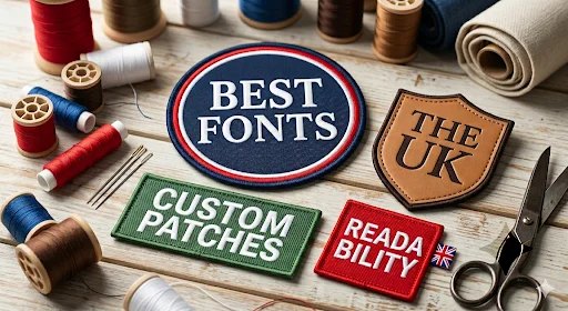
How Font Selection Can Ruin Your Patch Design
The choice of custom patch lettering styles matters the most in your designs that are to be made into a patch. As you know, there are different types of patches that are made differently with different materials, giving different looks and textures.
Just like this, there are different font families intended for each style, not every style can handle every embroidery font size for patches. Some patch types can handle bold fonts, some can handle sleek and complicated fonts.
The Golden Rule: Minimum Font Size for Custom Patches
Minimum Size for Sans-Serif Fonts
Keep clean sans-serif fonts at 4–5mm minimum height for clear results.
Minimum Size for Block Fonts
Use bold block fonts at 5mm or more so thick letters stay sharp.
Minimum Size for Script Fonts
Use script fonts custom iron-on patches or cursive fonts at 10mm+ because decorative shapes need more space.
Match Font Size to Patch Size
Minimum font size embroidery patch needs simpler fonts, while larger patches can handle more style and detail.
| Patch Size | Safe Letter Height | Recommended Font Style |
| 2 inch patch | 4–5mm | Simple sans-serif |
| 3 inch patch | 5–6mm | Bold block fonts |
| 4 inch patch | 6–8mm | Sans-serif or slab serif |
| 5 inch patch | 8–10mm | Bold fonts or clean serif |
| 6+ inch patch | 10mm+ | Script or decorative fonts |
Best Fonts for Embroidered Patches
Bold Gothic
- Fonts: Old English, Blackletter, Fraktur
- Thick lines stitch well and stay clear.
- Best for Gothic fonts for biker patches UK, club, and military looks.
Varsity & Block
- Fonts: College, Varsity Regular, Impact
- Big bold letters are easy to sew.
- Best for sports teams, schools, and gyms.
Vintage Serif
- Fonts: Bebas Neue, Rockwell Bold
- Strong shapes keep letters easy to see.
- Best for heritage brands and business logos.
Script & Brush
- Fonts: Brush Script, bold calligraphy
- Thick curves sew better than thin script.
- Best for events, handmade brands, and merch.
Minimalist Sans-Serif
- Fonts: Helvetica Bold, Futura Bold, Gill Sans Bold
- Clean lines in the font make stitching neat and clear.
- Best for modern brands and workwear.
Slab Serif
- Fonts: Rockwell, Clarendon
- Wide edges help the shape stay strong.
- Best for rustic, outdoor, and seasonal brands.
| Font Style | Font Examples | Why It Works for Embroidery | Simple Use Case |
| Bold Gothic | Old English, Blackletter, Fraktur | Thick strokes stitch clean and don’t break | Biker / club patches |
| Varsity & Block | Impact, College, Varsity Regular | Big solid letters hold shape well in thread | Sports teams / uniforms |
| Slab Serif | Rockwell, Clarendon | Strong edges stay stable when stitched | Rustic / outdoor brands |
| Bold Serif | Times Bold, Rockwell Bold | Thick letter parts stop thread from blurring detail | Business logos |
| Bold Script | Brush Script Bold, Heavy Calligraphy | Only works when letters are thick enough to stitch | Events / merch designs |
Best Fonts for Woven Patches
Clean Geometric Sans (Best Fit for Woven)
- Fonts: Avenir, Proxima Nova, Gotham, Arial Bold
- Works because tight weaving keeps sharp edges very readable.
- Best for small text where clarity matters most.
Narrow Sans-Serif
- Fonts: Helvetica Neue Condensed, Roboto Condensed
- Works because narrow letters fit more detail in a small space.
- Best for long names and small labels.
Modern Tech Sans
- Fonts: Montserrat, Open Sans Bold
- Works because even strokes stay smooth in a tight weave structure.
- Best for modern branding and logos.
Light Slab Serif (Controlled Use)
- Fonts: Roboto Slab, Courier Bold
- Works because structured serifs stay defined in a woven grid.
- Best for formal or industrial branding.
| Font Style | Font Examples | Why It Works for Woven Patches | Simple Use Case |
| Clean Geometric Sans | Avenir, Gotham, Proxima Nova | Clear shapes stay sharp in tight weave | Modern logos |
| Condensed Sans-Serif | Helvetica Neue Condensed, Roboto Condensed | Narrow letters fit more detail in small space | Long brand names |
| Modern Sans | Montserrat, Open Sans Bold | Even strokes stay smooth and readable | Everyday branding |
| Slab Serif (Light Use) | Roboto Slab, Courier Bold | Strong structure holds well in weave grid | Industrial looks |
| Bold Sans (Simple Text) | Arial Bold, Helvetica Bold | Simple shapes reduce blur in small sizes | Labels & tags |
Best Fonts for PVC Patches
Bold Geometric Sans-Serif
- Fonts: Gotham Bold, Futura Bold, Avenir Heavy
- Thick clean shapes mold perfectly in rubber.
- Works well because simple lines stay sharp in 3D PVC.
Heavy Block Fonts
- Fonts: Impact, Bebas Neue, Compacta
- Strong solid letters hold their shape in molded form.
- Works well because bold forms don’t break in rubber edges.
Modern Tech Sans
- Fonts: Montserrat ExtraBold, Poppins Bold
- Smooth modern letters come out clean and clear.
- Works well because even spacing stays readable in PVC.
Industrial Sans
- Fonts: DIN Bold, Roboto Bold, Eurostile
- Structured shapes give a sharp technical look.
- Works well because rigid design fits molded plastic style.
Minimal Condensed Sans
- Fonts: Arial Narrow Bold, Helvetica Condensed Bold
- Slim but strong letters fit small PVC patches.
- Works well because tight spacing still stays legible.
| Font Style | Font Examples | Why It Works for PVC Patches | Simple Use Case |
| Bold Geometric Sans | Gotham Bold, Futura Bold, Avenir Heavy | Clean shapes mold clearly in rubber | Modern logos |
| Heavy Block Fonts | Impact, Bebas Neue, Compacta | Thick letters stay strong in 3D form | Sports / bold branding |
| Modern Tech Sans | Montserrat ExtraBold, Poppins Bold | Even spacing keeps text smooth and readable | Clean brand designs |
| Industrial Sans | DIN Bold, Roboto Bold, Eurostile | Structured look fits molded PVC style | Tactical / industrial brands |
| Condensed Sans | Arial Narrow Bold, Helvetica Condensed Bold | Slim but clear letters fit small spaces | Small labels or tags |
Best Fonts for Chenille Patches
Bold Varsity Fonts
- Fonts: Varsity Regular, College, Athletic Block
- Thick letters hold well in fluffy yarn stitching.
- Works because big shapes stay clear in soft texture.
Heavy Block Fonts
- Fonts: Impact, Bebas Neue, Anton
- Strong straight letters show clearly in raised yarn.
- Works because simple shapes don’t get lost in fluff.
Rounded Sans-Serif
- Fonts: Arial Rounded Bold, Poppins Bold
- Soft edges of the text work on a fuzzy chenille look.
- Works because smooth curves blend nicely with yarn texture.
Slab Serif (Bold Only)
- Fonts: Rockwell Bold, Clarendon Bold
- Thick feet and strong structure stay visible in fluff.
- Works because bold serifs don’t disappear in texture.
Athletic Script (Thick Styles Only)
- Fonts: Brush Script Bold, Varsity Script
- Works only when letters are wide and heavy.
- Works because thick curves stay readable in the yarn pile.
| Font Style | Font Examples | Why It Works for Chenille Patches | Simple Use Case |
| Bold Varsity | Varsity Regular, College, Athletic Block | Big thick letters stay clear in fluffy yarn | Sports teams / jackets |
| Heavy Block | Impact, Bebas Neue, Anton | Strong straight shapes don’t get lost in texture | Bold logos |
| Rounded Sans-Serif | Arial Rounded Bold, Poppins Bold | Soft curves match the fuzzy chenille look | Casual brands |
| Slab Serif (Bold) | Rockwell Bold, Clarendon Bold | Thick serif edges stay visible in yarn pile | Retro / varsity styles |
| Thick Script (Limited Use) | Brush Script Bold, Varsity Script | Works only when letters are wide and heavy | Fashion / statement pieces |
Best Fonts for Leather Patches
Bold Serif Fonts
- Fonts: Times Bold, Georgia Bold, Garamond Bold
- Thick letters press nicely into leather.
- Good for fancy and luxury brands.
Minimal Sans-Serif
- Fonts: Helvetica Bold, Futura Bold, Arial Bold
- Clean letters are easy to stamp and read.
- Good for modern and simple logos.
Slab Serif Fonts
- Fonts: Rockwell, Clarendon, Courier Bold
- Strong block letters hold shape well in leather.
- Good for outdoor and classic styles.
Condensed Sans-Serif
- Fonts: Helvetica Condensed Bold, DIN Bold
- Small, tight letters fit small leather patches.
- Good for tags and short names.
Bold Script (Limited Use)
- Fonts: Brush Script Bold, Sign Painter Bold
- Only works if letters are thick and clear.
- Good for handmade and creative brands.
| Font Style | Font Examples | Why It Works for Leather Patches | Simple Use Case |
| Bold Serif | Times Bold, Georgia Bold, Garamond Bold | Thick serif edges stamp clean into leather | Luxury branding |
| Minimal Sans-Serif | Helvetica Bold, Futura Bold, Arial Bold | Clean shapes emboss and engrave clearly | Modern logos |
| Slab Serif | Rockwell, Clarendon, Courier Bold | Strong block edges hold detail well in leather | Rustic / heritage brands |
| Condensed Sans-Serif | Helvetica Condensed Bold, DIN Bold | Tight spacing fits small leather patches | Labels / tags |
| Bold Script (Limited) | Brush Script Bold, Sign Painter Bold | Works only when thick and well spaced | Artisan / fashion brands |
Fonts That Fail for Custom Patches
There are several reasons why small texts fail on embroidery and other patch types:
Thin Serif Fonts
- Fonts like Didot, Times Light
- Lines are too thin for thread or material
- Letters break or disappear on patches
Ultra-Thin Script Fonts
- Fancy handwriting fonts with tiny strokes
- Small curves get lost in stitching or weaving
- Words become messy and hard to read
Distressed / Grunge Fonts
- Fonts with broken or rough edges
- Patch making fills gaps and removes the effect
- Design looks unclear and messy
Overly Condensed Fonts
- Very narrow fonts like tall skinny styles
- Letters stick together after production
- Text becomes hard to read from a distance
Highly Decorative Display Fonts
- Fonts with extra shapes, curls, or ornaments
- Too much detail cannot be reproduced well
- Final patch loses clarity and sharpness
| Font Type | Fails In Which Patch Type | Why It Fails (Simple) |
| Thin Serif (Didot, Times Light) | Embroidery, Woven, PVC | Lines are too thin and break or disappear |
| Ultra-Thin Script Fonts | Embroidery, Woven | Tiny curves get lost and words become messy |
| Distressed / Grunge Fonts | Embroidery, PVC, Leather | Gaps get filled in, so “broken look” disappears |
| Overly Condensed Fonts | All patch types | Letters stick together and become hard to read |
| Highly Decorative Fonts | Embroidery, Woven, Leather | Too many details cannot be made clearly |
Thread Colour & Contrast
Choosing the right font style is not the only thing that matters from a well-known custom patch maker, if you choose the right font but mess with the colour and contrast which will make the time you invested in choosing the perfect font for your patch go to waste.
Light Text on Dark Base
- The right colour contrast makes letters stand out clearly and makes them easy to read from far away.
- Light coloured thread on dark coloured fabric like dark brown, royal blue, and black, work best.
Dark Text on Light Base
- Dark thread (black, navy, dark brown) on light fabric gives strong clarity.
- This is the safest and most common combination for patches.
Avoid Similar Colours
- Do not use colours that are too close, like navy text on dark green.
- Low contrast makes letters blend into the background and disappear.
Why Contrast Matters
- Small patch text needs a strong difference between background and the text.
- Good contrast helps people read the design quickly at a glance.
Extra Tip: Merrowed Border
- A merrowed (stitched) border frames the patch neatly.
- It helps separate the text area from the fabric and improves visibility.
Your Font Approval Checklist Before You Order
Take your time approving the proof and carefully make sure you confirm the following checklist:
- Zoom out your design, if you cannot read it small. It will fail on a patch.
- Make sure letters are not too thin. Thin strokes may disappear in stitching or might break and ruin the patch in other types that does ot contain threads
- Keep text at a safe and readable size because small letters often blur or merge together.
- Check the space between letters. Too little spacing can make words stick together.
- Use dark on light or light on dark colour contrasts because low contrast makes text hard to see.
- Remember, stitches follow direction, not pixels. Poor alignment can change how letters look.
FAQs
Choose the Right Font for Your Next Design
Choosing the right font is just as important as choosing the right type of patch according to the use and the conditions it is gonna face, along with it, the right colour should be chosen as well because it plays an equal role in the legibility of the design. If you choose the right font but not the right colour contrast, you are gonna get disappointed.
With all these settings, selecting a reliable patch maker like Patch Makers UK is also the top priority. If you want to order embroidered name patches UK, get clean, precise, and perfect patches. Get in touch with us today.